
 820
820
The Time Bank Usage Report provides a detailed history of how a user’s time banks have changed over a specific date range. You can use it to audit bank balances, verify payouts, identify usage trends, or review time-off activity. The report offers two display modes—Statement View and Month-by-Month View—each designed to surface different types of insights.
Prerequisites
-
Admins can view this report for all users.
-
Supervisors and Basic Users can only view their own bank history.
-
Relevant Banks & Balances must already exist for users.
Before you begin
-
Confirm which bank(s) you want to review (for example, Vacation, Sick, or Comp Time).
-
Decide whether you need transaction-level detail (Statement View) or a high-level usage overview (Month-by-Month View).
-
Identify the correct date range for your review (for example, a pay period, quarter, or fiscal year).
Steps
Go to Reports > Time Bank Usage.

-
In the user selector, choose the User whose bank history you want to review.
-
Enter the desired Date Range.
-
You can review a single day, a pay period, multiple months, or any custom range.
-
-
Optional: Turn on Include Pending Transactions if you want to see requests that have not yet been approved, carry over cap adjustments, future accruals and more.
-
Click Generate Report.
-
The page will refresh with two tabs: Statement View and Month-by-Month View.
-
Statement View
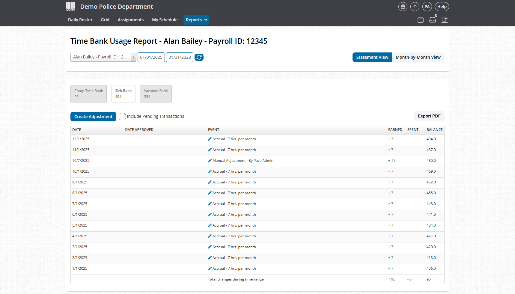
The Statement View functions like a traditional bank statement. It shows each transaction in order, along with how it changed the balance of the selected bank.
Bank selector
At the top of the statement, you’ll see a button for each bank (for example, Comp Time Bank, Sick Bank, Vacation Bank). Each button shows the current balance for that bank. Click a button to switch the statement to that bank’s history.
Columns in the Statement View
Each row in the statement uses these exact columns:
-
DATE – The date the transaction takes effect.
-
DATE APPROVED – The date the request was approved, if applicable.
-
EVENT – A description of the transaction, such as:
-
Accrual – 7 hrs. per month
-
Manual Adjustment – By Commander Smith
-
-
EARNED – Hours added to the bank (for example, monthly accruals or manual increases).
-
SPENT – Hours removed from the bank (for example, time-off usage or manual decreases).
-
BALANCE – The running total of the bank after that transaction.
At the bottom of the statement, a summary row shows the Total changes during time range, including total earned hours, total spent hours, and the net change in the balance.
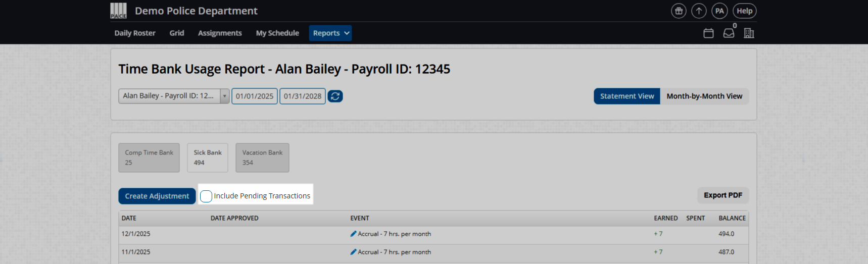
Include Pending Transactions
Use the Include Pending Transactions toggle above the statement if you want to see transactions that have been requested but not yet approved, or future accruals and carry-over cap adjustments. When enabled, pending entries will appear in the statement with their current status reflected in the dates and event description.
Create Adjustment (Admins only)
If you are an Admin, you will see a Create Adjustment button above the statement.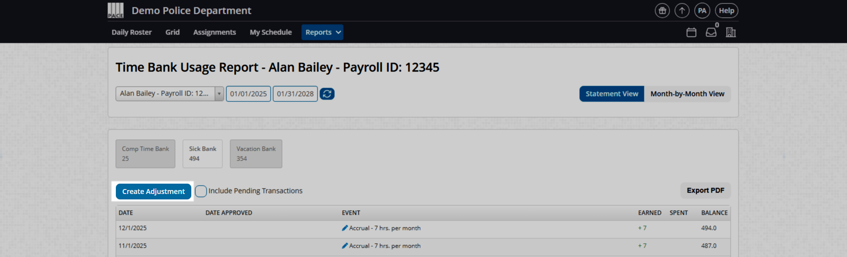
Use this to apply manual corrections to a user’s bank, such as:
-
Paying out or liquidating banked hours as pay.
-
Correcting a balance after a payroll mistake.
-
Adjusting for a previously mis-entered or canceled request.
You can also backdate an adjustment so the balance appears correctly in the historical record for that time period.
Exporting the statement
To download a copy of what you see on screen, click Export PDF in the upper-right corner of the statement. This is useful for audits, documentation to payroll, or long-term record storage.
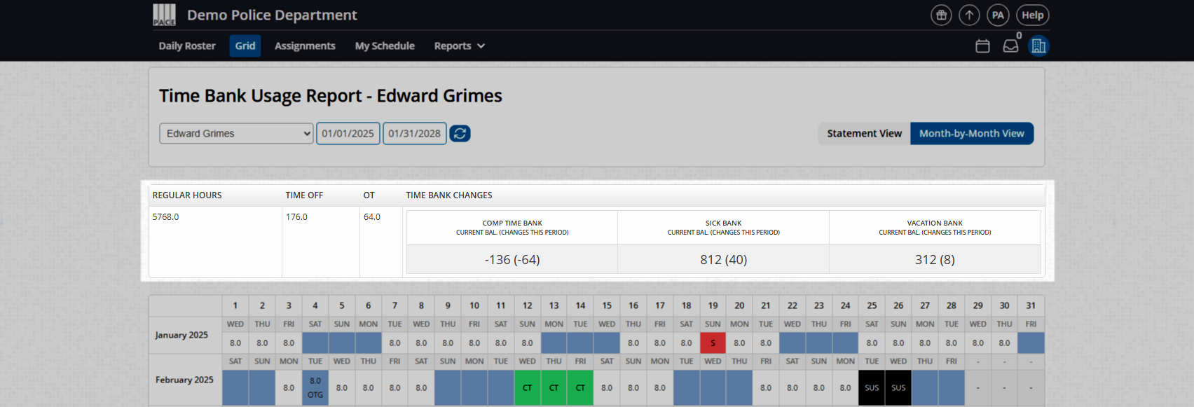
Month-by-Month View
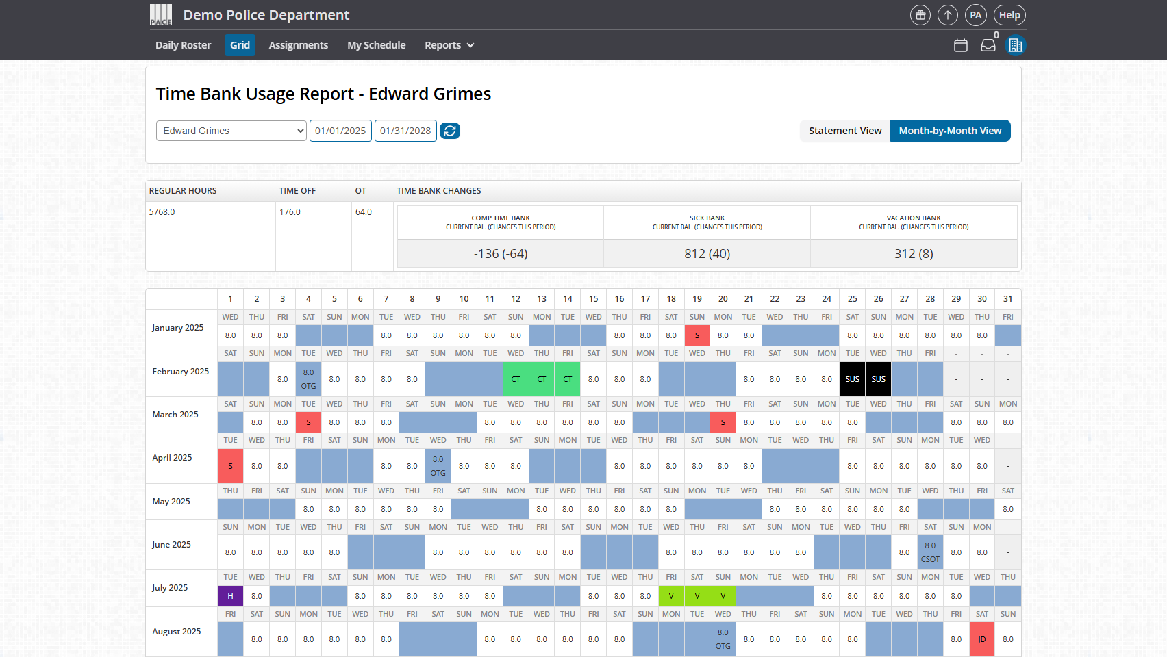
The Month-by-Month View offers a visual, calendar-style summary that highlights how a user is using their banks across several months at once. It’s ideal for spotting patterns, recurring absences, or spikes in bank usage.
What you’ll see
-
A multi-month grid that looks similar to a calendar.
-
Time off types displayed with the same color coding used on your Grid tab.
-
Example: if “Sick” is red on the Calendar tab, those same sick days show as red cells here.
-
-
Regular hours and OT hours listed numerically in each date cell.
-
Example of a fragmented day:
4.0 REG; 4.0 OT.
-
-
Regular Days Off (RDOs) displayed using the same formatting and colors you see on the main schedule.
This makes it easy to answer questions like:
-
“Is this user burning through vacation in big chunks or small, frequent days?”
-
“Do they tend to take the same day of the week off every month?”
-
“Are there visible spikes that might affect minimum staffing?”
Monthly summary table
Above the calendar/grid, you’ll see a summary table for the selected date range:
-
Regular Hours – Total regular hours scheduled.
-
Time Off – Total time-off hours used.
-
OT – Total overtime hours worked.
-
Time Bank Changes – Current balances for each bank and the net change within the selected range, typically shown in parentheses.
Confirm it worked
-
The report loads without errors for the selected user and date range.
-
Bank buttons display accurate balances at the top of the Statement View.
-
Statement rows show populated DATE, DATE APPROVED, EVENT, EARNED, SPENT, and BALANCE values.
-
The Month-by-Month grid reflects the same colors and patterns you see on the Calendar tab.
-
Exported PDFs match the statement you see on screen.
Troubleshooting
“I don’t see the user I want in the dropdown.”
-
Only Admins can view all users. Supervisors and Basic Users are limited to their own bank history.
“An adjustment didn’t appear where I expected.”
-
Confirm the DATE you used when creating the adjustment; backdated entries will appear in the correct chronological position for that date.
“My numbers look off when I compare to payroll.”
-
Make sure the date range in the report matches the pay period you are comparing against.
-
Check whether Include Pending Transactions is turned on; pending hours may not be reflected in payroll.
“Colors in Month-by-Month View don’t match the main calendar.”
-
The colors come directly from your time-off type settings. Verify the color configuration on the Calendar tab if there is a mismatch.
“The PDF export looks incomplete or cut off.”
-
Try a shorter date range and re-run Generate Report, then export again.
FAQ
Does the report include pending requests by default?
No. Pending transactions only appear if you turn on Include Pending Transactions.
Can I export the Month-by-Month View?
Only the Statement View supports direct PDF export. For Month-by-Month, you may take a screenshot if you need a visual snapshot.
Can I edit or delete existing rows in the statement?
No. You can only add manual adjustments using Create Adjustment. Those adjustments appear as additional rows.
Will negative balances show up in this report?
Yes. If a bank goes negative, the BALANCE column and summary will show that negative value.
Can supervisors adjust someone else’s bank?
No. Only Admins can see and use Create Adjustment for other users.

